

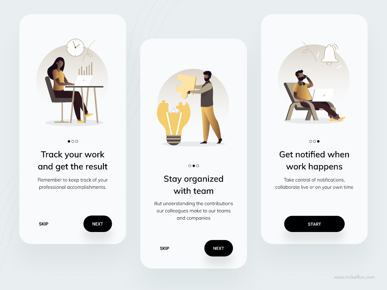

Good onboarding should not teach users everything about your app. It should help them understand its value and reach the right first action as quickly as possible. That distinction matters. Many apps begin with several informational screens, lengthy registration processes, and questions users do not yet understand the purpose of. The result is friction before the app has even had a chance to prove its value.
Start with the app’s first moment of value
The first thing you need to define is not which onboarding screens to include, but which outcome the user should reach. In a fitness app, that might be starting their first workout. In a booking app, it could be finding an available appointment. In an internal business app, it might be viewing today’s tasks.
This is often referred to as activation: the moment when the user experiences real value from the product. Your entire onboarding flow should be designed backwards from that point.
When we work with iOS and Android app development, user flows are therefore an important part of the design process from the very beginning. ScriptSector also considers wireframes, user flows, and clickable prototypes to be central parts of the design phase. A polished welcome screen will not help if the user still does not understand what they are supposed to do next.
Show the value before asking for too much
A common mistake is requiring users to create an account, upload a profile picture, enable notifications, share their location, and provide several personal details immediately after opening the app.
Every additional step needs to earn its place.
If a piece of information is not necessary for the user to reach their first valuable outcome, it can often wait. If the app needs location data to show nearby activities, for example, it is usually better to explain the benefit when the user actually accesses that feature.
The same principle applies to registration. If users can try one of the app’s core features before creating an account, that may provide a much stronger introduction than starting with a form.
Good onboarding teaches through action
Avoid building onboarding like a manual. Five screens describing five different features do not mean users will remember how those features work once they enter the app.
Instead, let users do something.
If your app helps businesses create quotes, for example, the first experience could guide users through creating a simple test quote. An empty dashboard with the message "Your quotes will appear here" teaches far less than completing an actual first task.
Effective onboarding can often be summarised in five principles:
- Guide the user towards one clear first goal.
- Only show information that is relevant right now.
- Ask for permissions when the related feature is actually needed.
- Make it clear how far the user has progressed.
- Allow users to skip steps that are not essential.
Adapt onboarding to the type of app you are building
There is no single perfect onboarding flow that works for every app. A social media app, a banking app, and an internal warehouse application have completely different requirements.
For a consumer app, creating motivation and quickly demonstrating personal relevance may be important. For an internal business app, the opposite is often true. The user already knows why the app exists and simply wants to reach their task as quickly as possible.
This is also why technology, target audience, and the scope of the first version should be planned together. In our guide to iOS and Android app development, we explain how your target audience, functionality, and platform affect the decisions that should be made early in a project.
Personalise onboarding without making it longer
Personalisation can make onboarding more relevant, but only if the user’s answers actually change their experience.
The question “What would you like to use the app for?” is useful if the answer affects the content, recommendations, or next steps the user sees. If everyone ends up on exactly the same home screen regardless of their answer, the question mainly adds unnecessary friction.
A useful rule is therefore that every question should have a consequence. The user’s answer should influence what they see, what is recommended to them, or which route through the app is most relevant.
This also makes the app easier to understand. Users do not need to learn the entire product first and then search for the features that are relevant to them.
Measure where users actually get stuck
Onboarding is not finished just because the design has been approved and the app has launched. You need to understand what users actually do.
At a minimum, measure how many users start the onboarding process, how many complete each step, and what percentage reach the app’s first meaningful action. Drop-off between steps, time to activation, and retention after onboarding are particularly useful metrics.
If a large number of users leave at the same screen, you have identified a clear point to investigate. That information is often far more useful than simply looking at the total number of app downloads.
When planning a new product, this is also a strong argument for keeping the first version focused. In our complete guide to app development, we explain the journey from an initial idea and feature prioritisation to a launched application.
Common onboarding mistakes to avoid
One of the most common mistakes is trying to explain too much. Another is optimising each individual onboarding screen rather than looking at the entire journey from opening the app to achieving the first meaningful result.
Be careful with mandatory tutorials, generic welcome carousels, and permission requests that appear before users understand why they are needed. Introduce features progressively and only when they become relevant.
It is also worth testing your onboarding flow with people who are unfamiliar with the product. Ask them to use the app without instructions and observe where they hesitate, become confused, or make unexpected choices.
Even a small usability test can reveal problems that are difficult to notice when you already know every part of the product inside out.
Build onboarding as part of the product, not as a layer on top
The best onboarding rarely feels like onboarding. It simply feels like the app is immediately helping the user move forward.
At ScriptSector, we help companies develop user flows, design, and technology for mobile apps from the initial idea through to launch. Onboarding can therefore be designed as an integrated part of the product from the beginning, rather than something added during the final week before release.
Do you have an app idea, or an existing app where new users are struggling to get started? Contact ScriptSector and book an initial meeting, and we can review your user journey and identify which parts should be simplified, moved, or tested.